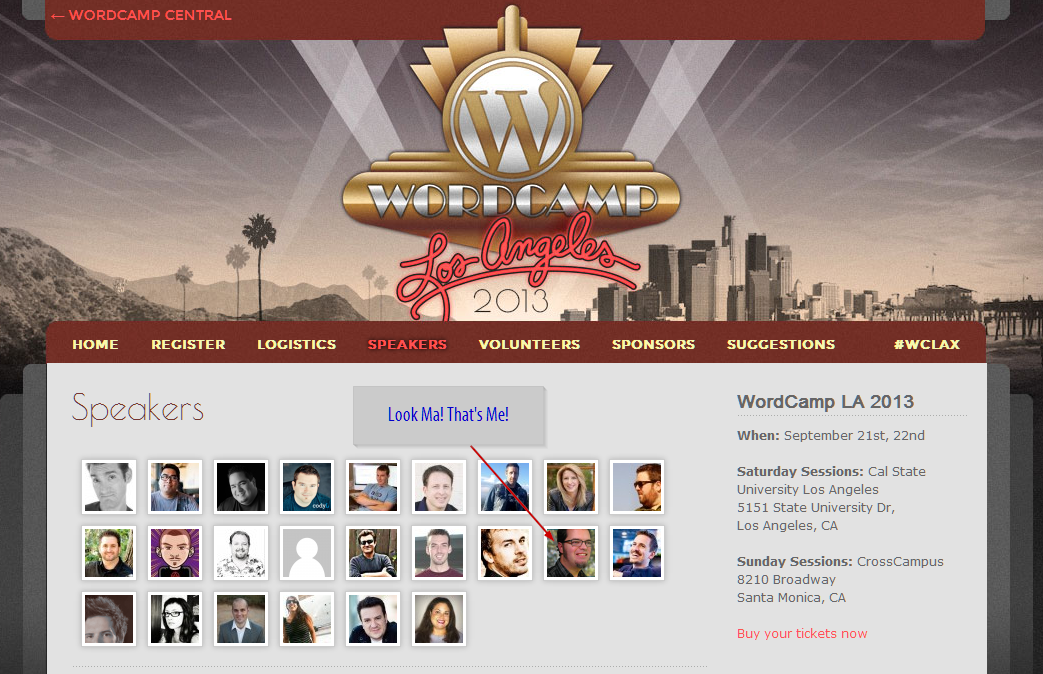
I’m thrilled to have the opportunity to present at WordCamp LA this coming September 21-22. I’ll be presenting “WordPress Troubleshooting 110 (not 101!).” WordCamp LA has an awesome group of organizers who have put together a stellar set of speakers and topics. There are currently less than 35 tickets, so jump over there and get your ticket. I’ll wait here.
…Seriously, go get it and then come back and finish the article.
Ok. Now everyone’s happier.
If Only I Had Natalie MacLees Skills!
I’ve only attended 3 WordCamps total (Miami, San Diego, and Orange County). This will be my fourth. At each one there have been excellent and not so excellent presentations. But if I think back on it, it’s hard to say exactly what separates the excellent from the not so excellent.
One of my all time favorite presentations was Natalie MacLees’ presentation on Responsive Typography at WordCamp Orange County. First off, her slides are amazing. She seemlessly weaves back and forth between the presentation and live examples of the code she’s talking about. Second, her content was just really, super useful. I learned a ton. So much that I’m still trying to implement stuff she talked about. Lastly, it was just really well organized easy to follow. (And I’m not just saying all this because she’s one of the organizers of WordCamp LA… really!)
For me, if I can even approach the usefulness, and professionalism of her presentations, I’ve won.
The other presenter everyone refers to who really is GREAT is Chris Lema. He presented at all three of the WordCamps I was at, and each one was great. He’ll be doing the keynote address at WordCamp LA, another reason to go for sure! He’s also written some excellent material on how to do great WordCamp presentations. So, there’s an awesome resource for me there too.
With Nathalie as a model, and Chris providing a virtual “how-to”, how can I go wrong!?
My Presentation Style
 My problem is that I always like to do things differently. Of course I borrow from others, but then I always tweak and twist, and hopefully enhance and improve on the model and go that “extra mile.” The problem with doing that stuff is that often, folks just don’t “get it.” People come to presentations with certain expectations and a set of filters which they will listen to my presentation through and instantly decide what to keep and what to throw out. If in the end, all my adaptations and “improvements” distract from their expectations, then … it’s the Gong show!
In the end, though, I’ve decided I really can’t do anything else than be myself. I want to take the example that Nathalie and Chris have provided, and tweak and improve on the model. If I do that successfully or not, we’ll see. But here’s what I’m thinking:
1. Awesome and Simple Slides
Both Nathalie and Chris emphasize the importance of having really simple and minimalist slide content. Chris says one idea per slide and don’t muck it up with too many words. Take Chris’ “Done Done: Embracing a Value for Execution” presentation. If you flip through the slides you can see the natural flow of the argumentation he takes. The images speak volumes, and the words just help you focus on the current subject at hand. It’s great.
Caveat…
If you don’t have the video alongside the presentation — you only have the slides — then the slides are sometimes a poor reference to the actual content and usefulness of the presentation. Since I’m following Nathalie’s lead and building a site that will serve as the presentation, I’d like it to be super useful as a resource all on it’s own. It’ll take more time in building it, for sure. But I think it’ll be more useful in the end and hopefully something people can go back to later and use when they get in trouble on their site.
2. Give them a Take-Away
Chris is a professional business consultant. His take-away at every presentation I’ve seen is his approach and ideas. The content of the presentation itself is why it’s worth your time to sit and listen for 40 minutes instead of just follow his SlideShare page.
Nathalie, on the other hand, did much more of a “how-to” and pointed us to online resources to help accomplish the goal of responsive typography. My presentation will be more like Nathalie’s, so I do really want to integrate resources and tools.
How I’ll Ramp it Up
I’d like to provide some “white paper”. It might seem outdated, but I find that no matter how comfortable you are on the web, if you have something handy on your desk you’ll refer to it much more quickly than if you have to Google it and risk that it’s going to be the 3rd or 4th page in. Plus, the topic really lends itself to a sort of checklist approach, or a grid matrix. We’ll see where that goes exactly, but if you had a one-page resource that helped you figure out exactly what the problem with your site was, wouldn’t that be valuable!?
Performing or Educating
If you haven’t been to a WordCamp, you should know they are most often split between two “tracks.” One for developers, and one for entry-level users. They always give each track a cute name. At WordCamp LA the Developer track is called “Hollywood” and the User track is called “Vine.” I’m speaking in the Vine track, which lends itself towards more “how-to” or educational talks.
Chris wrote another great presentation article called “Performers not Professors.” In it, he argues that people will remember your content by how well it is presented. If your presentation sucks, no one cares how good the content was. The thing is, I’m a professor in training. I’ve done my fair share of presentations with students, done workshops and sermons at churches: I’m an experienced presenter. But I’m most comfortable when I’m educating.
It’s Both/And

In pedagogy, you learn that teaching is more than lecturing; but it’s also more than entertaining. A class session can be really fun, but utterly useless for a test or real life application. Or vice versa: a class can be packed full of important and useful information but what good is it if those in attendance are snoring on their desks by the end of it?
It’s not either/or, it’s both/and.
With that in mind, my goal in presenting is to provide detailed and useful information in a memorable and fun way. Seems kinda impossible, but Chris also says I shouldn’t just “wing it.” Practice, refine, improve, cut down, draft, re-draft, then crowd source it to a few trusted WordPress devs and see what they say. Sounds like a plan.
Want a Preview?
My presentation will be here eventually. If you’d like to help me by previewing it and providing feedback, go to the site and sign up to be notified. I’ll email folks early with a link when I’m ready for feedback.